What is UX/UI?
UX is the acronym for User Experience, it is a recent concept about making design decisions while thinking about the user experience. The UX designer needs to be concerned about whether their product is easy to use and intuitive, making changes to it whenever necessary to suit the user’s needs.
UI stands for User Interface. It is everything involved in the interaction of the user and the product. The UI designer is responsible for developing interfaces, not only limited to the visual aspects but also ensuring that the interfaces are functional and usable and generally contribute to a good user experience.
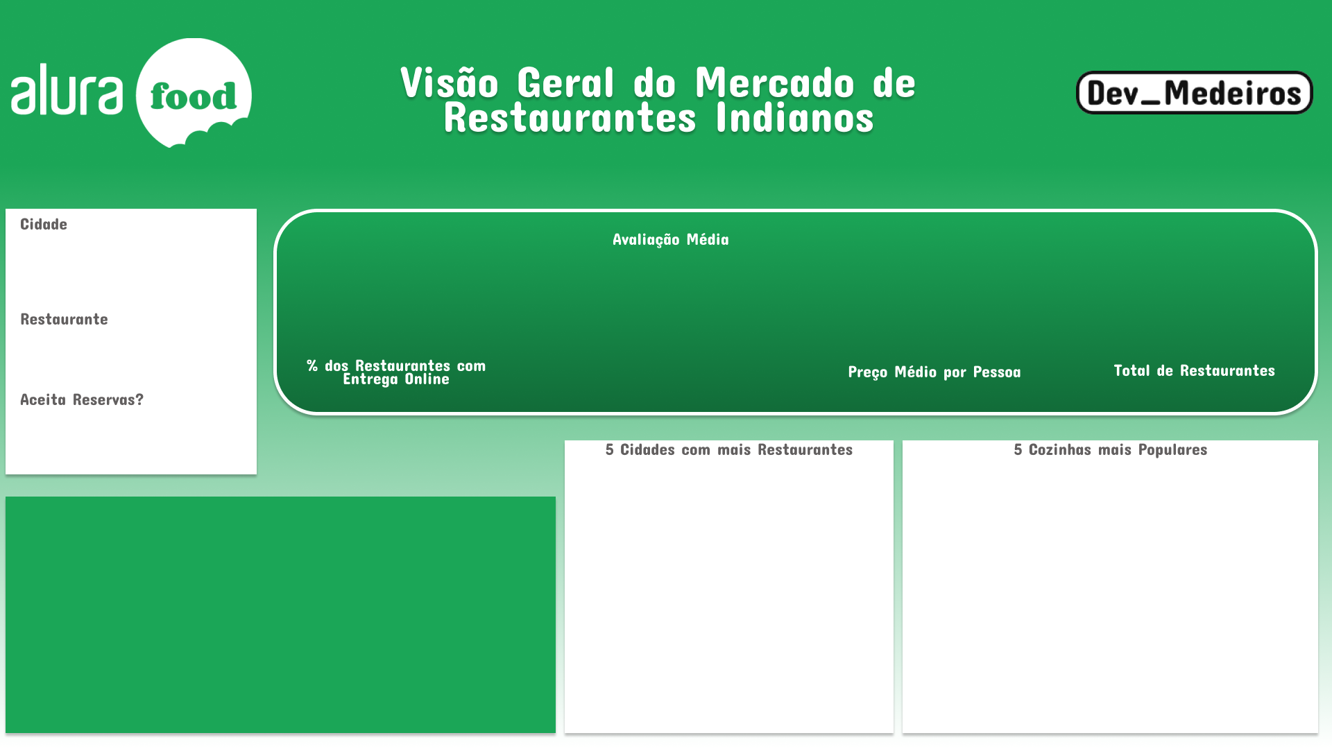
How to Improve the Experience of BI Dashboards?
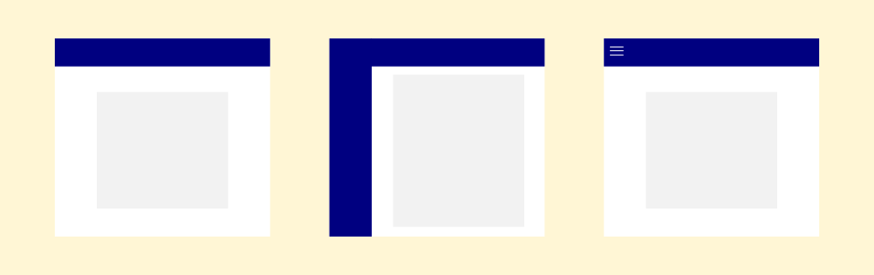
Many people see BI dashboards as web pages. This comes with some expectations. For example, most sites that have some navigation system use a top menu with buttons, a side menu (most common in Brazil being on the left, but in some countries, it is on the right), or a hamburger menu (the one we click on it and the options appear).
Jaqueline Medeiros - All rights reserved
With this, a majority of people who use the dashboards expect to find navigation buttons and data segmentation (filter) in these places, in addition to other information such as logo and title.
Data Segmentation
Also commonly called a data filter, it is a fundamental part of several dashboards, its positioning needs to be defined carefully, because if it is in a place that the user does not expect, it can prevent your dashboard from being used efficiently, in addition to maintaining a visual standard for everyone its filters help people more easily recognize what is and isn’t a filter.
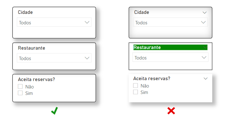
You can and should use and experiment with different themes in your projects. What matters, when making it easier for users, is consistency, pick a model for your filters with the desired colors and all the graphic specifications that are of interest to you and use it in all filters, as this will help people quickly find it and recognize that it’s a filter.

It’s common for people when they are reading something on the computer to position the mouse pointer where they are reading. For Power BI, this makes it easier for the user to find the clear data segmentation button because when hovering the mouse over the filter name, a rubber appears on the left side where the filter name is. If you use Power BI, you probably already knew that, but we can improve this by using something that the user already knows, which is the rubber, and create a button using it as an icon and make this button clear all filters at the same time. If you want to know how to make this button here, in the Power BI forum, explains how.
This feature needs may be unnoticed at first. Regularly dashboard users don’t realize which filters they have used or they use so many that they just want to be able to clear the selection faster and more efficiently, so this button makes the process easier.
Page Navigation
Power BI’s native page navigation is not intuitive for most people and you may want to direct the navigation in a specific flow that facilitates understanding and contributes to the intended storytelling. In this case, we have the option to hide all the report tabs, except for the opening/home page. But what’s the best way to direct the user to the other pages? Suppose your report is simple, you have an overview tab and another tab with a breakdown, a simple button would solve your problem, but if your report is extensive it may be unfeasible to put a button for each tab on all pages.
Jaqueline Medeiros - All rights reserved
In this case, it might be interesting to consider having a home page that leads to all the other pages and placing a home or back button on them.
How to Improve Dashboards Interface?
Prototyping Programs
Using a specific program to prototype your dashboard allows for greater artistic freedom compared to what Business Intelligence applications typically provide. Figma is a great tool for this, you can create advanced backgrounds and prototypes with amazing quality to use in your BI dashboards.
Here’s an example of a dashboard I made a few months ago:
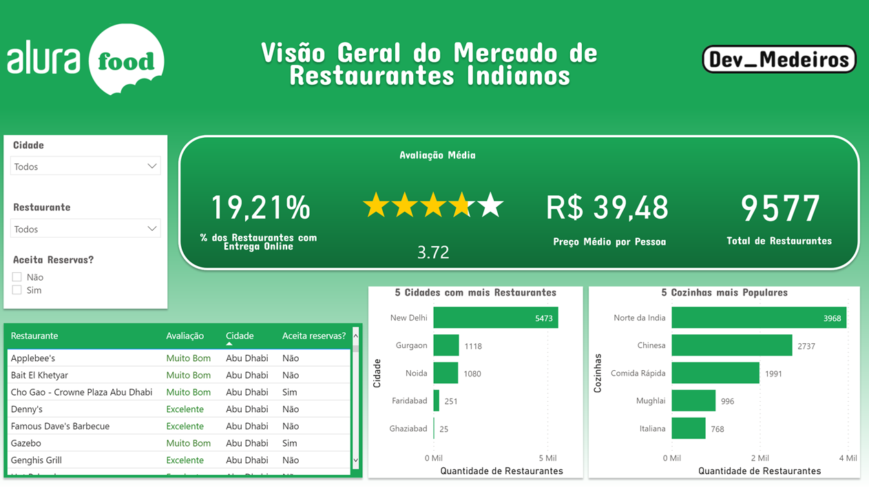
The background of this panel was done completely in Figma, even some of the titles of the BI visuals.
You can check out more Power BI Dashboards I made for Alura Challenge BI.
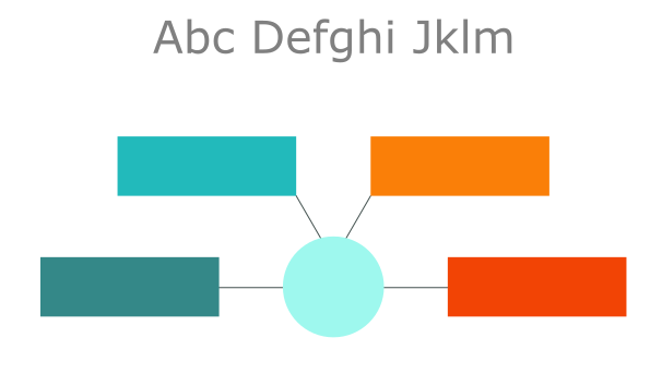
Figures and Icons

Vector created by pch.vector - br.freepik.com
Figures and icons when used correctly help make the panel stand out, and make it more eye-catching and beautiful. There are several ways to get images, if you or your team can’t create them yourself there is the option of using online platforms that provide vectorized images. On these platforms, there are free options, which require some type of attribution, and premium (paid) options, which often do not need to attribute the author and have a higher quality.
ICONS8 icon