Introduction
I’m learning data visualization in Python and I see myself as a ‘hands on’ learner, so I’ll be reproducing some basic plots using seaborn package that you can use as a reference everytime you need to fresh up your memory.
At first is required that the packages are properly imported, after that I load the iris dataset.
| |
If you’re not familiar with the iris dataset, you can see its first five rows below:
| sepal_length | sepal_width | petal_length | petal_width | species |
|---|---|---|---|---|
| 5.1 | 3.5 | 1.4 | 0.2 | setosa |
| 4.9 | 3.0 | 1.4 | 0.2 | setosa |
| 4.7 | 3.2 | 1.3 | 0.2 | setosa |
| 4.6 | 3.1 | 1.5 | 0.2 | setosa |
| 5.0 | 3.6 | 1.4 | 0.2 | setosa |
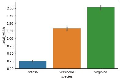
Barplots
To create simple barplots.
| |
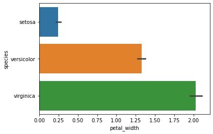
Making a horizontal barplot.
| |
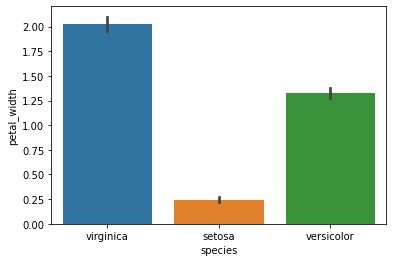
Custom bar order.
| |
Add caps to error bars.
| |

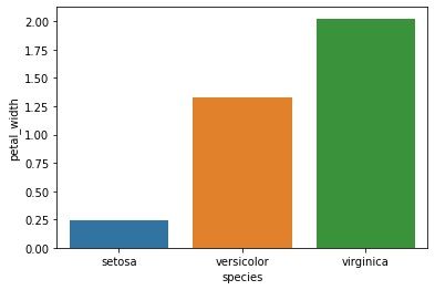
Barplot withough error bar.
| |
Scatterplots
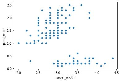
A simple scatterplot.
| |
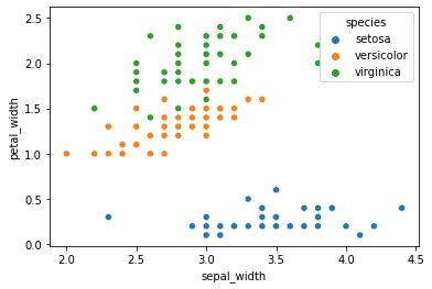
Mapping groups to scatterplot.
| |
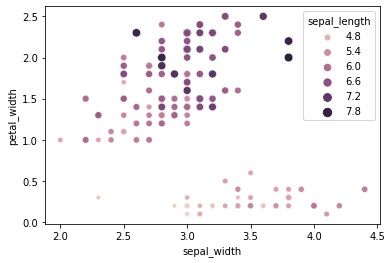
Mapping groups and scalling scatterplot.
| |
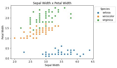
Legend and Axes
To change the plot legend to the outside of the plot area, you can use bbox_to_anchor = (1,1), loc=2. The following plot has a custom title, a new x axis label, and a y axis label.
| |