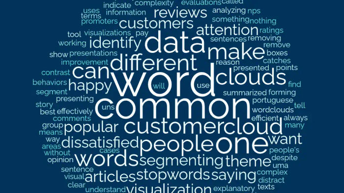
Word clouds are a popular data visualization tool for analyzing texts, comment boxes, and reviews. And it’s not popular for no reason, it is an efficient visualization to show the opinion of a group of people in a summarized way, but it is not always presented effectively. So, here are some points to pay attention to when presenting the best word cloud you can.
1- Removing common and irrelevant words
One of the most common words in the English language is the article “the”. This is not surprising, given that it is essential for forming sentences, but despite being fundamental, when we think in terms of how it helps to explain the theme or idea of a sentence, it does not contribute to it at all. These articles and other common words are called stopwords.
So, whenever we work with word clouds, it’s important to remove these stopwords to make it clear what your theme is and to reduce information pollution.
2- Simplicity over complexity
When working with visual presentations, it’s common to want to do something extravagant that catches people’s attention, but sometimes complex visualizations can distract people from the story you want to tell and make it difficult to understand your message.
3- Segment your data
One of the most common uses of word clouds is in customer reviews and company evaluations (such as NPS), in these cases, where we have different “types” of customers, it’s expected that they have very different behaviors, a satisfied or happy customer will have different comments from one who is dissatisfied. So, if you make only one-word cloud without segmenting your data, you may find a word cloud that means nothing more than “many people mentioned this”.
By segmenting the data by customer ratings or by detractors and promoters, you can identify what customers who are happy with your service are saying and contrast it with what those who are dissatisfied are saying, and identify areas for improvement.